
 Here is my first watercolor piece. Obviously it is not finished yet but I hope to finish it soon. I am still a little bit shy with the handling of colors and pushing their intensities more but I am getting there. I do love the medium. It seems to produce some very nice effects. I can't wait to finish this piece to start another one. We'll see...
Saturday, July 31, 2010
Trumpet Flower Fairy
Here is my first watercolor piece. Obviously it is not finished yet but I hope to finish it soon. I am still a little bit shy with the handling of colors and pushing their intensities more but I am getting there. I do love the medium. It seems to produce some very nice effects. I can't wait to finish this piece to start another one. We'll see...
Friday, July 30, 2010
Artificial - My Illo for this week's IF
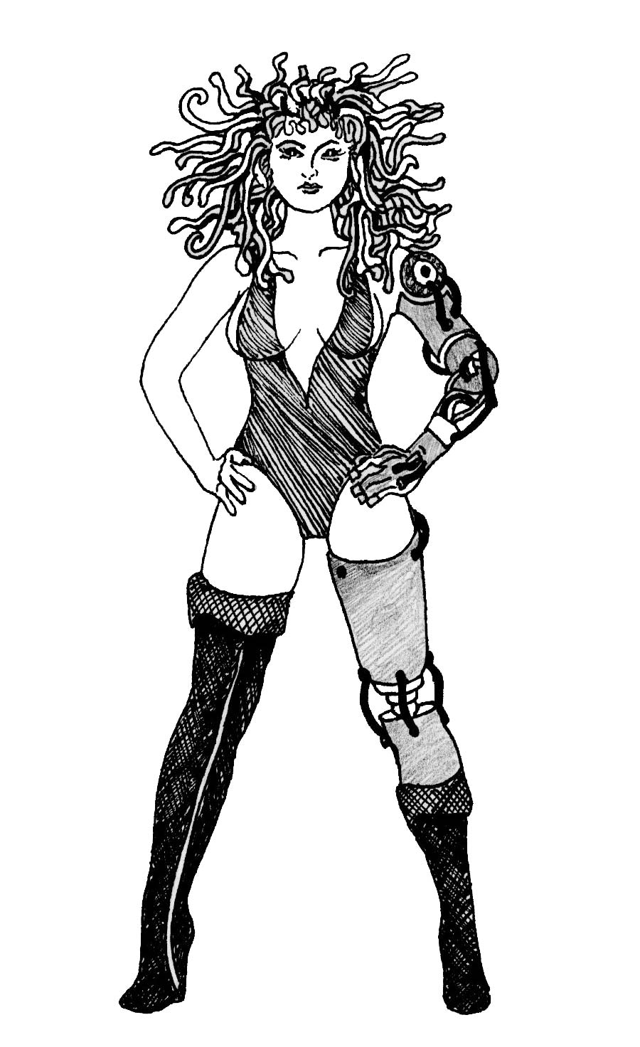 This is my illustration for this week's Illustration Friday theme: Artificial. She might have some artificial parts but she still looks good. What do you think guys?
Trumpet Flower Fairy
 This is a sketch I did of a fairy inside a trumpet flower. I will use this sketch for my first attempt at watercolors. I'll be taking a class tomorrow.
Tuesday, July 27, 2010
DAY 3 - My First SCBWI-Carolinas Conference
Starting the day...
Day three and I am exhausted. I can't imagine how all the speakers are feeling. We are all sleep deprived.
Day 3 was only half a day event. I only attended one workshop since others were more for writers than illustrators.
Picture Book Dummies...
This workshop was presented by Elizabeth Dulemba, an award winning children's book author/illustrator.
In this workshop we learned how to create book dummies. She gave us copies of thumbnail templates that we could use to do our own. They are on her website for everyone to grab http://dulemba.com/
She showed us her successes with book dummies as well as her failures. This was a very informative workshop. I learned really good stuff.
The discussion then turned to the ipad. Elizabeth recently created her first iphone and ipad picture book, called Lula's brew: http://dulemba.com/ActivityPage-Lula.html. She had over 6,000 downloads of the book in just a few days. It was really beautiful to see.
After this workshop, it was pretty much over for me and I headed home to take a little nap to recover from all the information overload.
It was a great experience. I can't wait to see what they have planned for next year. These conferences were worth it, in my opinion, specially if you have never been to one. I am not sure what would happen once you start attending every year. I am not sure if things will start to sound repetitive but I think overall, it was worth the money I paid for it.
DAY 2 - My First SCBWI-Carolinas Conference
Starting the day...
General Session - presented by Liz Waniewski, an editor from Dial Books for young readers, an imprint of Penguin Young readers group.
This session was more for writers. I learned about the 13 imprints that are part of the publisher, Penguin. Another thing I learned was about all the picture books that were not of interest to them at this time. I suspect that is probably the case with other publishers too. They were:
- Bed time
- Monsters behaving like adults
- Cats & kitties
- Going green
- I love you books
- Visiting grandma
- Boredom
- First day at school
- Bird learning to fly
- Holiday stories are also tough because of the short period of time to sell these books.
First Impressions - with Laurent Linn...
This workshop was pretty cool. People were asked to submit illustrations and Laurent Linn, the art director, critiqued them. No illustrator name was mentioned. The art director did not know who submitted the work.
I did not submit anything for this workshop, I had run out of illustrations to show but I was glad to see the wonderful works of other illustrators. The critiques were fabulous and full of tips.
At the end of the workshop, he reminded us that sending postcards to promote ourselves was the way to go. He also said that just because we don't get responses, it doesn't mean that people are not paying attention. He added that we should try to send new work out every 3 to 4 months.
Another thing that caught my attention is when he mentioned that most of the picture books his group did used traditional art. Looks like that is what they are getting more of? I am not sure.
Conversations - From submission to marketplace...
This was another workshop geared towards writers but I attended because I think it is important to understand a little bit about what writers do. After all, we have to illustrate their stories.
It was a really enlightening experience. I really got to understand the process that writers go through to get their stories published.
The speakers were editor, Liz Waniewski and author, Alan Gratz. They took us through the process that Alan's new book, fantasy baseball, went through to get published.
It was an eye opening experience to see the extensive amounts of editing the book went through. Alan wanted to use an extensive long list of well known characters on his book (characters from classics like the Wizard of Oz). Not all of these characters were in the public domain so he had problems with that. Legally, that caused him to rewrite certain sections of the book and for others, he had to ask permission from the creators of the characters. Some granted permission while others didn't. I certainly admire Alan's dedication redoing the manuscript so many, many times. He showed that when you have passion and believe in what you are doing, you can make things happen.
After looking at the ratio of writers versus illustrators out there, I have to wonder how writers do it. There is such a large number of writers out there that competition is really fierce.
From this workshop, the part that really touched me was when author, Alan Gratz, told as a story about his daughter. She came home one day all upset because other children at school were laughing at her. They were laughing because she had told them that she believed in fairies. Alan later found, in his backyard, a little house build in the woods, by his daughter, for her fairies. It was then when he got to see how deeply children believe. Ever since, the fairy house has improved. Take a look at all the additional work that has been done to it since: http://bit.ly/cj0FL8
I thought that was the sweetest story.
General Session...
Visual storytelling with pictures and words - by Laurent Linn
This event was a lot of fun. We had Laurent Linn show us illustrations from different, well-known, illustrators and painters. He talked about the principles of storytelling and emotional connection for each one of the illustrations he showed. He helped us see the difference between a beautiful art piece and a piece that told a story. A lot of things to learn from this session.
He also told us how he wouldn't hire Rembrandt to illustrate a children's book because children books' illustrations must tell a story. I thought that was funny.
Inventing Story - Cocktail party...
After all the workshops, we had a wonderful cocktail party with great h'orderves. Here is where I got to finally talk to more illustrators and writers. Our portfolios were also on display for everyone to see. I had an additional illustration displayed at the SCBWI table because of my contributions to their 'Pen & Palette' publication.
This was yet another great day at the SCBWI-Carolinas conference. What a treat!
I will be publishing the last day at the conference soon..so continue to stay tune if you want to hear more.
DAY 1 - My First SCBWI-Carolinas Conference (Part 2)
Part 2...
After my 'Illustration Intensive' workshop, I had the opportunity to have my portfolio reviewed by Laurent Linn, the same art director we had for the workshop.
It was a rather short review. All participants spent about 15 minutes with Laurent. 15 minutes went by really, really fast. I wish it had been longer.
Before the review, we were asked to drop off our portfolios 10 minutes prior to the meeting so the art director could see them first.
My portfolio was comprised of about 15 pieces. 10 of those pieces I completed a while back during the Zero2Illo, 12 week challenge and the subsequent 4 week challenge which some of you, reading this post, might be familiar with. If not, here is the blog that explains it all: http://zero2illo.com/
The remaining 5 pieces on my portfolio, were pieces I had around that I felt were good enough to put on my portfolio. When I assembled the portfolio, I realized that it was never going to be perfect. But if I continued to wait to create the perfect pieces, I would never get my illustrations out there. So I pushed myself to look over what I already had and find pieces that I felt were good enough (not perfect) to include on the portfolio.
One of the speakers in one of the workshops mentioned that there was once a test done to see who produced the best illustrations. The group that spent endless hours perfecting their one illustration or the group that was drawing different things constantly. It turns out that the group that didn't spent so much time perfecting things but moved on to create new illustrations, produced better quality illustrations. Something to keep in mind.
Portfolio Review Time...
For the portfolio review, the art director and myself met in the boardroom. The boardroom was very executive looking with all the fancy chairs. It was way too formal for my taste and when the door closed, it was so quiet inside. That door sure kept all the noise out.
In spite of the formality, I did not feel intimidated or nervous at all. I already knew Laurent from the previous workshop so I felt fairly comfortable.
Before the start of the review, he told me that he was going to go through the portfolio twice. The first pass while we talked and the second pass for the actual critique.
On the first pass, the art director opened up my portfolio and immediately told me that I had a lot of imagination (if he only knew how right he is. I just have to find the time to put it all on paper). He then asked me why I liked illustrating for children. I wish I could repeat what I said to him but I seriously don't remember. Perhaps I was not as comfortable as I thought. We then talked a little bit about my favorite artist, James Christensen. It turns out that he was a big fan too and collects some of his work just like I do.
After a brief conversation, the critique started and here are some of the comments he made:
Illos 1 through 5
These are 5 pieces I did during the zero2illo 12wc (you can see them better at my portfolio site - http://mariasportfolio.com/illustrations/children/). The purpose of these pieces was to show sequential work but I have to say that this particular art director never mentioned the importance of having that on your portfolio.
In any case, the theme of the story was about two friends, a bear and a cat, (called Teddy and Squeekie) going out to play with Teddy's new toy, a red bike.
 Critique:
The art director loved what I did with the edges of the page on illo #2 and #4. Without knowing the story, he felt that it was a clever usage of the page and a nice interactive idea.
I had these pieces critiqued, by illustrator friends, prior to coming to the conference. I was told to be careful with what I did with the page (I don't remember why). I think it was related to potential printing problems. But I am glad I decided to leave it as is because at least this one art director liked the idea. I do feel that sometimes you have to take risks to get your ideas across.
The art director enjoyed the energy of the characters and how I took the time to give the characters their own personality by giving them their own little costumes. He was big on that.
He felt, however, that I could have done a less generic grass and flowers. He also noticed how I have shading in some areas but then I switch to outlines in others. Once again my problem is that I need to establish a light source and think about it more when I am drawing.
Illustration #6
This piece was also done for my portfolio during the zero2illo 12w challenge. It is called 'How to tickle a stylish dragon'.
 Critique:
He was immediately drawn to this piece because of what I had done with the clothing and costumes I had given the characters. He was pointing at the dragon and the little girl while telling me that.
If you read part 1 of this post, you will have a better idea of the Art director's background and you will see why he was excited about the costumes which is something he got to do while working with Sesame Street and the Muppet workshop. By giving the characters something unique, we are enhancing their personalities for the readers.
But once again he pointed out that the characters blended a bit with the background which all boils down to lighting/shading and contrast. I kind of saw that on this piece when I was making it but found it hard to fix. Oh well, maybe my next illo.
Illo #7
Yet another piece I did during the 12 week challange. This piece I also used on my promo-mailer. It is called: 'Let's Paint a Zebra'.
 Critique:
He was once again drawn to the piece because of what I had done with giving the characters their own personality. He pointed to the little girl and said that by making the little patterns on the clothes, we now knew a little bit more about the character. He thought that it was details like that that enriched a scene. He also mentioned that the little girl felt a bit stiff. Usually children or even adults don't stand so straight. I do agree with that.
Nothing further was said about this piece but he stopped to grab the promo-mailer I had included in the front flap on my portfolio. He wanted one to take with him.
At this point, we started to move faster because it was only a 15 minute review.
Illo #8
Another piece, but this one I did during the 4 week challenge. This one is called 'Playing with Balloons'.
 Critique:
He thought that this was a successful piece. Because of the angles but also because I kept the building colors somewhat monochrome and made the rest pop with color which made it an eye catching composition. But he felt that I could have pushed the shading a bit more around the buildings and he also felt that the bird was a bit flat. Once again the contrast thing I really need to work on.
Illo #9
This is an illustration I did a while back. It is called a 'Majestic Party'.
 Critique:
It is going to feel like a broken record but once again, the art director enjoyed this piece because of all the detail I had put into the costumes. He is big into that. However, (you probably guessed it by now), the characters blend a bit. Once again, the contrast thing.
Illo #10
Another piece I did a while back. It is called the 'Archer'.
 Critique:
He enjoyed it once again because of the patterns in the clothing but he felt that it was more of an art piece and it didn't quite tell a story. I do agree with him on that. I'll probably take this piece out of my portfolio.
Illo #11
Another piece I did a while back. This one was about, Squeekie the cat falling in the toilet.

Critique:
He liked the piece but he specifically pointed out the items in the room and not so much the cat. He did that to make me see how I chose to put some shading around the toilet but when it came to the cat, I changed to an outline which made the cat look a bit more like a cartoon. Once again, contrast, contrast, contrast.
Illo #12
The next piece I showed. I call this one 'The Graduate'.

Critique:
Well, I think you know, by now, what the problem is with this piece. Yes, you guessed it. Great costumes but characters blend because of lack of contrast. I have to wonder if that is my innate style of doing things or am I afraid of playing with contrast?
Illo #13
This is an illustration that I also did for the 12wc. I call this one 'I can't find my Giraffe'.
 Critique:
This one made him laugh. He thought the theme was very funny. We then proceeded to talk a little bit about cultural differences. He knew I was not born in the U.S and he, himself, is of French descent and spent 1 year in France doing illustrations.
He mentioned that sometimes the American market can be tricky and some people might frown at seeing the cat being tied to the giraffe by the little mouse or that a child might get uncomfortable seeing the little girl with a giraffe face (wow, I wonder what a child would do if they wanted to dress up as a giraffe for Halloween).
I think he is partially right. I do find myself sometimes thinking very differently from the masses and I tend to attribute that to being a foreigner but I also have to say that I have seen far more crazy things in animated films, videos, etc. I do see his point though, people can sometimes be sensitive to these things.
Will I stop drawing like that?....probably not. Once again, sometimes you have to take risks to get your ideas out there.
It was here where I took the opportunity to ask him about where to go to learn more about what children might like or not like. What colors they might react to more or some sort of resource that would help us, illustrators, understand what children are thinking when they look at books. To my surprise, he did not have an answer for that. For himself, he said that he learned a lot about kids from his local librarian. So he suggested that I check with librarians in the area. They might be a good source for opinions.
In closing...
The remaining 2 pieces were quickly looked at but we had run out of time which raises the question that perhaps if I only had 10 to 12 pieces, I might have gotten more detailed feedback on a particular piece. I think I see why it might be important to not have too many pieces on your portfolio.
After the portfolio review, it was still not over for the day. There were more workshops going on but they were being held at the same time so you had to pick which one to go to. A lot of the workshops were geared towards writers so I tried to do those that targeted illustrators or both.
Next workshop...
Protecting your work
The next workshop I went to was about protecting your work. This was a wonderful workshop offered by Fred Parker, an attorney in Charlotte, N.C. He discussed the basics of intellectual property law for writers and illustrators.
You should be putting the copyright symbol on your illustrations but that alone does not necessarily cover all costs if somebody steals your art. Registration of the art is obviously the best policy but often times not financially feasible for illustrators. It seemed like putting the copyright symbol and sending yourself an e-mail with the illustration to establish a time line was the best route.
He also mentioned that he has seen some cases stand up in court when the writer or illustrator embeds tells (I think that is what he called it) in their work. Writers sometimes do that by inserting a capital letter or something on a particular paragraph. With my imagination, I was already plotting to strategically place my initials somewhere embedded in the art.
It was certainly a very interesting workshop. I am glad I went.
Some theater...
After the previous workshops, we had an evening event called: 'Principles of Story Theater'. We were entertained by Nick Kerns of UNC Charlotte as he led a group of people in acting out an oft-told tale. He also gave us a view of what it meant to be involved in Story theater.
We all laughed a lot at the people from the audience who were so gracious to play the roles in the story. It was a fun time.
The Schmooze...
Later that night, a small group of us met to discuss what we could do to keep engaged during the year. Bonnie Adamson was running the schmooze and she took some ideas with her. I am not sure where that will lead.
This was the end of Day 1 of the conference.
I will be posting Day 2 soon. Stay tuned.
Monday, July 26, 2010
DAY 1 - My First SCBWI-Carolinas Conference (Part 1)
Hold on tight. Long reading...
Before I begin, I want to mention that I'll be posting another part to day 1 since this post got really long and I am still not done with all that happened on day 1. My next post will be about my portfolio review. I also apologize if my English is not great. I tried.......Enjoy!
Word of the day...
If I was asked to describe my experience in one word, that word would be: WOW
My first conference was really an unforgettable experience. I learned so much. These conferences are unique and filled with people that have passion for writing and illustrating. There was a lot of energy from the panel of experts invited to speak at all the workshops. We had wonderful 'award winning' speakers at the conference. Some of them were representing major publishers in the U.S.
The conference was 3 days long. It was draining, I have to admit. There was so much going on and so much to learn. It is safe to say that it is going to take me a few days to recover from this one.
I cannot disclose all details of my experience because as a member of SCBWI, I want to make sure that people continue to support these conferences by assisting. It would not be fair to the speakers at the conference either but I hope you get some benefit from what I do disclose. Most of it relates to my artwork specifically. In addition, I wanted to mention that all the speakers at the conference were experts in their fields yet it is important to understand that sometimes they expressed their own personal opinions and not necessarily those of the industry. So try not to assume that what one person says is necessarily the rule throughout the industry.
What a first impression...
When I arrived to the conference, I immediately met two, very friendly, ladies at the registration desk. I quickly recognized them. They were: Bonnie Adamson and Teresa Fannin. I met them both through e-mail and twitter so it was nice to meet them both in person. What a pair. They worked so hard and with so much passion to ensure the success of the SCBWI-Carolinas conference that it was beautiful to see. Combined, they definitely had more energy than me. This conference was indeed a success and I am glad I went. Thank you, Bonnie and Teresa, for what you do.
Here is a picture of me with these two wonderful ladies. Bonnie Adamson to my right and Teresa Fannin to my left.

Pre-conference workshops...
I signed up for 2 additional activities. The 'Illustration Intensive' and the 'Portfolio Review'. For the Illustration Intensive we were taken through the simulated process of dealing with an art director. Before the conference, participants were given a short manuscript about a retell of the story the 'Tortoise and the Hare' . The retell was called 'The Tortoise or the Hare'. We were expected to submit a sketch (full spread) of a scene of our choosing. The art director would then comment back and we were expected to incorporate those comments and bring the final art to the workshop. I have to say that this was a lot of work for me. I had never drawn bunnies before and I admit that the story didn't quite inspire me, even though I knew it was a classic. At the end I am glad I did it. It was so, so worth it.
We were very, very lucky to have an Art Director that was pretty cool and totally fun to interact with. His name is Laurent Linn. Laurent has been in many of the major conferences in other states so a lot of people know him. He is an Art Director working for Simon & Schuster Books for Young Readers. He worked as a puppet designer in Jim Henson's Muppet Workshop and he became the Creative Director for Sesame Street, winning an Emmy Award. In spite of all of his credentials, for someone that I have never met before, in my eyes his biggest accomplishment was elevating the art of critiquing to a new level. I felt that his critiques were the most meaningful critiques I have ever received. His method of delivery was really special and very professional. To come out of a critique even more inspired is, for me, rather unusual.
Here is a picture of me and Laurent Linn:

He also has a really cool website: http://www.laurentlinn.com/
So it all begins...
Here is what happened in this workshop and how it almost turned into a disaster for me.
I was able to create the initial sketches, as assigned, which was good. I have shared those here, on my blog, before (http://bit.ly/agw7h8). Then I got the comments back from Laurent. He definitely made me see things that I would have never seen on my own. His main comments were:
- With so many hares, a child might get confused and not realize that they are all the same hare (excellent point). He offered the solution of potentially adding motion techniques to tie them together but left it up to me to decide.
- He wasn't sure why my audience did not have any animals or children (Wow. Another excellent point. I don't know why I did that. It makes no sense).
- He felt that my hare could be wilder with the poses. The hare was supposed to be an athletic character. (Oh great, I thought, I don't know how to draw bunnies well and now I have to make them athletic? Yikes!).
After I analyzed the comments further, I realized that the best solution was to re-do the entire scene again. I then went into panic mode for a few days as I tried to understand how I was going to get it all done on time. To add to my mental state, I started to get really busy with school as I was approaching my finals for the quarter. I had to work on a website and on a design of a social media site. Two time consuming activities but also my main priorities.
The crisis continues...
It was now a week before the conference and the end of my quarter at school and I was already resigned to the idea that I was going to show up with nothing completed. New sketches were not the issue, it was the painting that I was worried about because that takes time.
In my desperate moments, I got the e-mail from Illustration Friday with the new word for the week: Acrobat. I decided to draw something for that and somehow I decided to draw a hare and a tortoise. I think subconsciously, I was feeling guilty. The theme for the week was perfect to attempt to draw an acrobatic hare.
Never good enough...
I finished the illustration and posted it on Illustration Friday but it was a rather quick illustration. It did not feel quite finished as I tend to deepen my colors more and the trees were too simple. I then started feeling really guilty and the idea of not showing up with something for the conference became unacceptable so I went ahead and completed another illustration (the whole spread was supposed to be 11X17). While I was happy that I had something to show, I would be lying if I didn't say that the pieces were rather unfinished. I am more used to deepening the colors and adding more detail to my illustrations but I ran out of time.
The moment of truth...
Here is what I presented to the Art Director:
 I took a risk. Well, I think I took more than one. I was the only one in the class that changed the entire composition from the initial sketch. I didn't get to work on this piece the way I would have liked to. The colors are too soft for me but oh well, we don't always get to do what we want.
The lessons I learned, from Laurent Linn, at the workshop were lessons that I will try not to forget when I illustrate going forward. Here is what he said we should all try to aim for when illustrating:
- Storytelling. Use the illustration to tell the reader what the story is all about.
- Emotional Connection. Not just a composition that looks beautiful but a composition that establishes a connection. That is accomplished with what the face, eyes and body movements are doing. Often times kids don't know how to feel until you tell them with the eyes and face.
- Every object in the scene is a character. A couch, a lamp. Give it personality.
- Kids are never still. When they have an emotion, they really let you know with exaggerated body movements. Do the same when drawing animals and children.
- Costume Design. Helps give an idea of who the characters are which text might not.
- Showing motion of a character, with anything other than motion lines is a good thing to do.
- Keep the story moving forward
With those concepts in mind, Laurent started the critique of my illustration.
The Good:
To my surprise, he believed that my new composition was a good choice and that it worked much better than the previous one.
He felt that there was storytelling just by the fact that the hare was doing acrobatic moves on top of the tortoise's back. That leaves the reader wanting to learn more. I also immediately presented to the audience what it was all about - a tortoise and a hare. He thought it was clever that I dared to have the hare do acrobatics on top of what is supposed to be his enemy, the tortoise. He also liked the idea of having the two characters together because it gives the child an opportunity to decide who to go for, the tortoise or the hare.
For emotional connection, he felt that I did a good job at that too. Specially as it pertained to the hare and the tortoise on the second page.
 These are two contrasting emotions and I guess that also helped establish the emotional connection. It also gives a visual cue to a child of how to feel about each character based on their facial expressions.
The Not so Good:
I connected right away with all the things, he said, I needed to work on because deep inside I knew that I had rushed through the work to get it done and I did not really have a final piece. I can tell he picked up on that too.
- The trees were too generic (I couldn't agree more. Trees are time consuming and I couldn't dedicate to them. When done well, however, they add greatly to a scene. They are supposed to be characters that add to the story and they should be unique.)
- The eyes of the hare looked a bit too cartoonish for him (He is right. I do need to practice drawing more bunnies.)
- The tortoise has a little hat that gives him personality but I did not do anything special for the rabbit. (He is right, I did give him shoes on the initial sketch but I did not add anything on the final piece. It is unusual for me not to add detail to my pieces but in this case, I ran out of time).
- The hare blended a bit too much with the background (Very true. My color palette I thought was too soft and does not reflect my style but I have weaknesses on the use of contrast too).
- The way I used black (like in the movement lines) was a bit too strong. He would have used another color. (I agree and I saw that when I was doing it but it was too late to change).
- The characters in the crowd looked a bit unfinished (Yes, they did because they were..oopps!).
- Think of light sources. (I do need to work on contrast, shading, etc.)
A little surprise we were not told about until the end...
The retell of the story is now an actual published book. It was a retell because it was thought that the message of the original one was a bit too strong and for the retell, the author wanted to make both characters winners. At the end, the tortoise and the hare ended up as friends so they were both winners of a friendship. We got to see the book, written by Toni Morrison (a Nobel Prize-winning American author) and illustrated by Joe Cepeda. Here is a link to it: http://amzn.to/9qlcES. I purchased a copy for my collection and because I am now connected somehow to the story.
The illustrator, Joe Cepeda, did an outstanding job with the illustrations.
Points of interest...
- One of the spreads, on the published book, had a series of 3 illustrations of the hare doing acrobatics. I thought that was interesting because I had the same exact layout on my initial pencil sketch but the comments back from Laurent were that I needed to connect the illustrations so a child would know it was all the same hare. He explained that for that particular spread on the now published book, they had to leave it as is because of time constraints but he would have gone back to the illustrator for a redo to show motion-connection between all the hares.
- There was another spread that contained an illustration of the hare holding a prize and the tortoise holding a newspaper. I almost drew something similar to that but after asking friends for opinions about the story, just about all of them could not get past the original classic story written by Aesop. It was hard for them to see the story as a retell and the tortoise and the Hare as friends (all my friends were past age 40 so they grew up knowing the classics and a retell was not quite as acceptable, I guess). I wasn't born in the U.S so I was not exposed to those classics until much later in life and therefore I did not understand why it was so difficult to understand the retell. The whole thing was very interesting to me. I ended up dropping my plans for an illustration of that particular scene because I thought that if others couldn't get the new retell, chances were I was probably not understanding it either.
Overall, it was a wonderful workshop. I encourage all people out there, in this business, to truly consider being part of such a wonderful conference. I consider myself lucky to have had Laurent Linn as the first art director to look at my work for critique. I certainly believe now that critiques are another art form or at least Laurent Linn has made it one. Even though we all need to understand that at the end some of the critiques are sometimes personal opinions and they can be subjective, there was something special about the way Lauren Linn delivered his opinions. It does not compare to any critique groups out there. Sorry! (personal opinion here).
He ended the workshop by giving us some wonderful words of wisdom. It was explained that for Simon & Schuster, digital work was treated like any other medium and they had no preference for digital over traditional because it was not about the medium. It is always about the characters, the stories and the emotional connection. So if you are thinking of abandoning a medium that you really love because you think you are falling behind with all the trends out there, those words should offer some comfort.
Some of the final points he made, I believe are somewhat standard and I have already heard them or seen them on other websites before so I think I can share them:
- Send postcards to art directors. They still work fine. If we were to look at the offices of art directors and designers, we would see postcards hanging all over the walls, doors, etc.
- Keep things organized on a website. Separate B&W from color and also group mediums.
I didn't do it justice...
Still with this post, I don't feel I relayed my experience well. Reading it is soooooo very different from experiencing it. I cannot emphasize that enough. I met so many wonderful people, so many talented people, yet not for one moment did I feel my work was not good enough. I crossed that bridge long time ago and learned to love my art but I wasn't sure what to expect for my first conference so I was a bit nervous (I admit) about someone of the caliber of Laurent Linn looking at my work. What a fool I was to think that way as there was indeed nothing to worry about. Everybody was so wonderful that I felt right at home.
I don't know enough about other SCBWI conferences in other states. Sometimes I think that going to the larger ones is a good thing because there is so much energy in the room and so much to see but I also think that you might get lost in the crowd. The SCBWI-Carolinas conference was somewhat small in comparison to the one in Los Angeles and NY. I would say we were probably a total of 250+ participants? maybe? I didn't keep count versus the LA conference which I think was pretty large. I would love to go to the large conferences some day but I am very happy that ours was not as big because I think each one of us got special treatment.
If you are in North or South Carolina, I highly recommend this conference. I don't have experience on any other, but from all the reading I do about others around the country. I think they are all really exciting and worth it.
One last note...
I asked about illustrating characters whose faces were drawn to look directly at the readers. I tend to do that on some of my illustrations. I have heard that we are not supposed to be doing that and instead we should try to draw as if observing the characters' world. I was glad to hear the response because I think it makes sense. It was mentioned that that was a thinking of the past but that today it is all about interactivity. Having the reader interact with a character is not a problem at all. That was nice to hear because it makes total sense to me.
Keep in mind...
I want to remind all of you that the entire post was written based on my perception of what I experienced at the conference. So the words mentioned here are my own interpretation of what was said. They are not direct quotations or words from any of the speakers or participants at the conference. I also asked permission from those featured on this post.
Also, I will be posting part 2 and the remaining 2 days at the conference in a few days....stay tuned.
Double - My illo for this week's IF
 This is my contribution to the Illustration Friday theme: Double. One bunny is cute but two are trouble. Leave them loose in your house and they will chew everything on their path.
Monday, July 19, 2010
Breakfast - My illo for this week's IF

This is the illustration I did for this week Illustration Friday's theme: Breakfast. As you can see, poor Jimmy did not get his breakfast. He should have read the warning on the cereal box.
I can't find my giraffe - Finished
 ...and here it is. The final piece, done and completed but I still cannot find my giraffe..:-(
Friday, July 16, 2010
I can't find my giraffe - New sketch

This is a sketch that I started with the purpose of including it on my physical portfolio to show at the SCBWI-C conference.....but I do have to wonder, where is my giraffe?
Saturday, July 10, 2010
Topic: Diary - This week's IF

I have a diary where I record all my daily thoughts and dreams. Do you?
Friday, July 9, 2010
Dana - Keeper of the Black Jewel
 This is the final drawing from a sketch I did over 4 years ago. I sometimes find pieces, around my studio, that I started but never finished. I am now determined to start something and finish it. I'll be searching my studio for pieces that I started but never finished.
The name of this new piece is 'Dana - Keeper of the Black Jewel'. Dana is a faerie with magical powers and she has been given the duty of caring for the black jewel which has the power to control life or death in her kingdom.
Saturday, July 3, 2010
A New Sketch
 Working on a sketch to relax my mind from the frustrating task of updating my website. This is a sketch of a fairy holding a rock or an egg. I gave not decided yet. Enjoy!
Subscribe to:
Posts (Atom)


